
GIF 1-

In preparation for this session we were given a list of words to create pages of sketches in relation to. Out of all the titles the cooking one took my particular interest, as I believe it would give me more of an interesting scope to create a GIF from. When sketching I decided to go for an alternative approach to the prompt of 'Cooking' and took a magical route. I created a simple character and decided that I wanted to represent to magical transition in baking, where the ingredients become a came. After finalising this concept I realised that it would be very much suited to a younger audience as they would resonate well with the magic element and it would relate well to there limited understanding of the world, as young children don't understand the process of things, so I think this GIF is a humorous play on that.


After I had decided on the concept I scanned in my sketch at 300 dpi and added a layer over the top of my sketch so that I could draw over it digitally to ensure that my line work became more crisp and complete, making it easier to work with further on. After that I used a variety of layers to add the colour to the character, ensuring to keep to a simple colour palette, using colours of a similar tone. Following that I really wanted to add another dimension to the image as it looked quite flat, therefore I added a layer that was on top of all the other colour layers and chose a very bright tone, to add areas of light on the character so that it brought it to life. I learnt this idea from a YouTube video (https://www.youtube.com/watch?v=9xt5uAnUzms) about how to create dramatic lighting in your digital drawings, although it is quite a comical video it was very helpful and I think that this method has definitely improved my work.


After I finished my drawing I began to look into animating. I started work on this GIF before the session, therefore I learnt how to animate my drawing from a variety of sources (eg. https://www.youtube.com/watch?v=-IR-0jMcBaU) which meant that I chose the option of 'Create Video Timeline'. Although within the lecture we were told to choose the option of 'Create Animation Timeline' There was no way of me converting the work I had already done to that format, so continued with what I was already working with. Despite the fact that the method I used being difficult to get the hang of I did find that it gave me a lot more options when animating my work. The setup made it easier to trail different animations, working with opacity, placement etc. Plus if these experiments didn't work very well I was able to revert it with ease, and because this option created a timeline for each layer of the drawing I was able to change the properties of them individually without it changing the whole piece. Because of this I was able to toggle the opacity of the lighting to give the affect of a glow, while the ingredients moved at a much faster speed. Furthermore to way the timelines worked meant that I could look into timing and introducing new elements to the GIF. So I was able to create a flash layer and a cake drawing layer that appeared later on in the GIF, the only problem that you could run into with this method is the looping factor that a GIF should have so that it has the ability to play endlessly with a jump that makes it look like a really short animation. To combat this I decided to add the flash animation at the end of the timeline and end it after that, so that the ingredients appeared again following the loop.
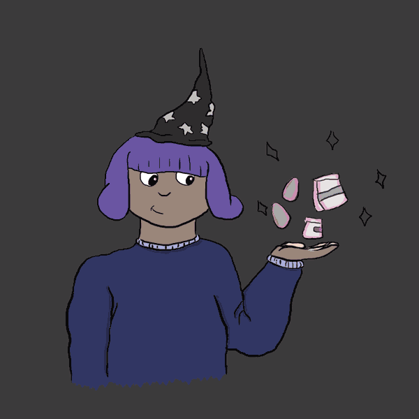


When it came to exporting the GIF for web I did have a few difficulties as a result of the format I had created it in. A result of this was when I first opened it in my browser after saving it, the animation cycle was really slow and it wouldn't appear within the browser window as a singular object, it instead flooded it with colour. To fix this I trialled many different ways of exporting the GIF and I was able to fix it, the main element that caused the problem was the file size as the browser took too long to process the information of the file, which is what caused it to be so slow. As you can see from the resulting GIF's I've inserted above, the first is the version before the flash and cake, I think that it definitely need the added elements as it isn't very engaging in that state. The second 2 GIF's I've inserted are the same but after exporting one ended up without the outline of the drawing, I have shown both as I think that although this happened it somehow still works well, however I can't decided which version of the GIF I prefer. Overall I am quite pleased with the final GIF I produced as the timing works really well and although I ended up using an alternative method I'm happy with how many things I was able to achieve, as well as being able to make the loop look seamless. When I make GIF's in the future within Photoshop I think I will still use this method as it has more editing opportunities, however I think I will have to use my layers more efficiently so that the setup is easier to work with, as it does have the likelihood of being very confusing.
GIF 2-


For my second GIF I decided to go for a different approach, after receiving feedback of the character in the first GIF being too obvious and wooden in expression. Because of this I selected an image off the internet to draw over, therefore ensuring I was working with a real life subject, rather than making up characters that people couldn't sympathise with. Despite using a pre-existing image I wanted to make it my own so in place of simply drawing around the figure, I coloured in the light and dark tones using only two colours. This is a method I have brought across from my drawing module, as looking closely into light and dark areas helps to give an object form and helps to ground them within an environment. I also did this so I could work with lighting more strongly as I really liked the effect it had in my previous GIF. As you can see in my first screenshot I tried to work with 5 colours to create the dramatic lighting that I envisioned, however I soon realised that the colours didn't work together well at all. The rectify this I worked with a more limited colour palette of just purple and blue, and I believe that the result is a lot more successful than the previous. I chose these specific colours as they are quite cold and I wanted to create the tone of loneliness and isolation in the piece.