
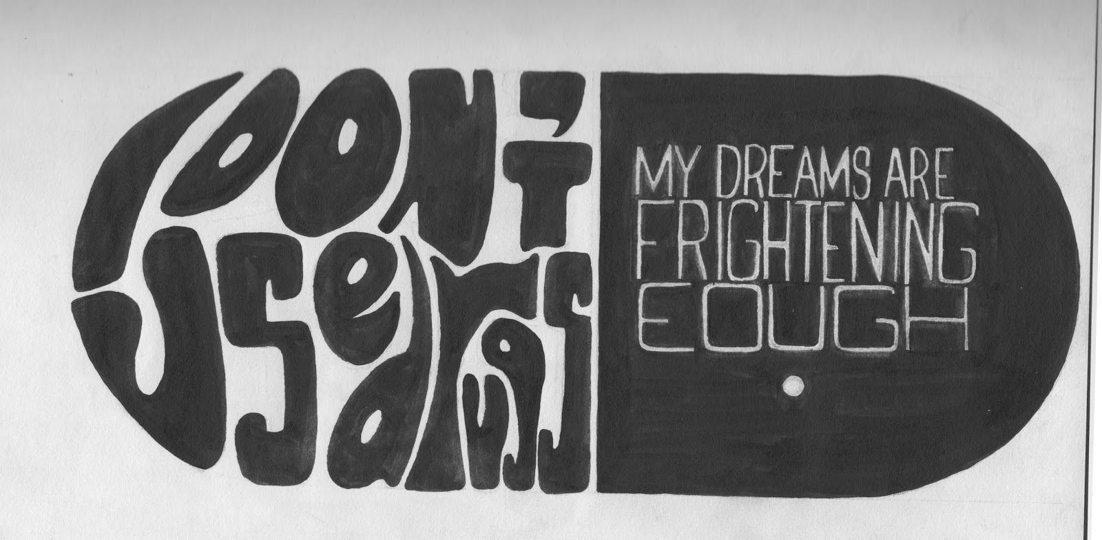
For this weeks session we had to choose a quote from a given list and create a design for it that aided in the communication of quote itself. For my design I knew that I wanted to take quite a graphical route that had a simple look, but also had strong imagery. I broke down the quote into the main themes it included, which were, drugs, fear and a shift to a serious tone. From this I split the quote in two, the first half that regards the drugs I decided upon quite a psychedelic font that is reminiscent of the 60's, which was the decade known for the height of Hippy culture and the recreational consumption of drugs. For the second half of the quote I went for a more conservative style that communicates the serious tone, as well as the elongated lettering making it look a bit off, therefore communicating the uneasiness and fear in the quote. Once I had decided on the typography I wanted to include a graphic element that represented the main theme of drugs rather than relying on the 60's font. Because of this I put each half of the quote in adjacent halves of a pill/capsule, and made the text the negative of the background colour. Also because I knew this design was going to be laser cut and because I've worked with this process previously, I knew that creating a negative in this way would be a really effective way of using the medium. As the black of the design is engraved so on the left the text will be inset, communicating carelessness as well as outlining the pill frame, and the text on the right will be prominent, showing the true seriousness and meaning of the quote.

Before working with my design in Illustrator I first removed the background of the page and changed in for white, then used levels to increase the contrast. After that I used the Threshold tool to make the design as dark as possible, therefore making it easier to work with in Illustrator. Before I changed to Illustrator I was given some feedback on the design I had created and was told that I should work further into the text on the right by enlarging it, and changing the position within its segment so that it stood out more and looked equal to the left side. I achieved these changes by using the 'Lasso' tool to select the individual word, put them on their own layers and worked with them in isolation until they were all of a similar size and were arranged correctly. Then on a layer underneath them all I filled in the black of the design where the text had been moved.

After I had finished in Photoshop I began working on my design in Illustrator, where I used 'Image Trace' to form the design into separate elements so I could easily edit if I needed to. Then I used the 'Smooth Brush' tool to smooth the edges of some of the letters so that the design looked a lot cleaner. Following this I got further feedback on my progress and was told that I should probably increase the gaps between some of the letter on the left to make sure the letter's didn't merge when they were cut, and that I should edit the letter 'U' as it looked too much like a 'J'. To make these changes I firstly used the rubber tool to increase the letter spacing and then using the brush tool i changed the shape of the 'U' so that the letter looked more recognisable. Once I had finished editing my design I saved it as a '.ai' file so I could change it in the future if needed, and then I exported it as a '.BMP', as this is the file format the laser cutter can read.

It was later brought to my attention, just before my work was to be laser cut, that there was a spelling mistake in my piece. I was able to quickly correct this mistake my repeating the process I originally went through, but just before that, while in Photoshop, I selected one on the smaller N's and enlarged it to fit into the word, 'ENOUGH'. Therefore I could fix this mistake while making sure the typography still looked uniformed.
Final (Corrected) Quote-

