

(Original Book Cover)
Initial Sketches-


1. My first idea for an illustration based on the text is a scene of the main character's father sat on his bed gazing blankly out of the window. I have chosen to illustrate this as it's a really pinnacle point in the story where for the first time Oliver sees how broken his father is. In my illustration I want to convey how motionless he is and I'm going to have a strong focus on his eyes to show his tiredness and the blankness of his expression. Also to show that he is looking out of the window I'm to over-lay a layered of white in the shape of the bedroom window and lower the opacity so that it shows the light coming through the window and reflecting on him. I will also try putting a blue filter overlay on the image to represent the drowning aspect of his emotions, as later in the book he describes his depression as feeling as though he is underwater so I believe that this would be a subtle but effective way of representing this.


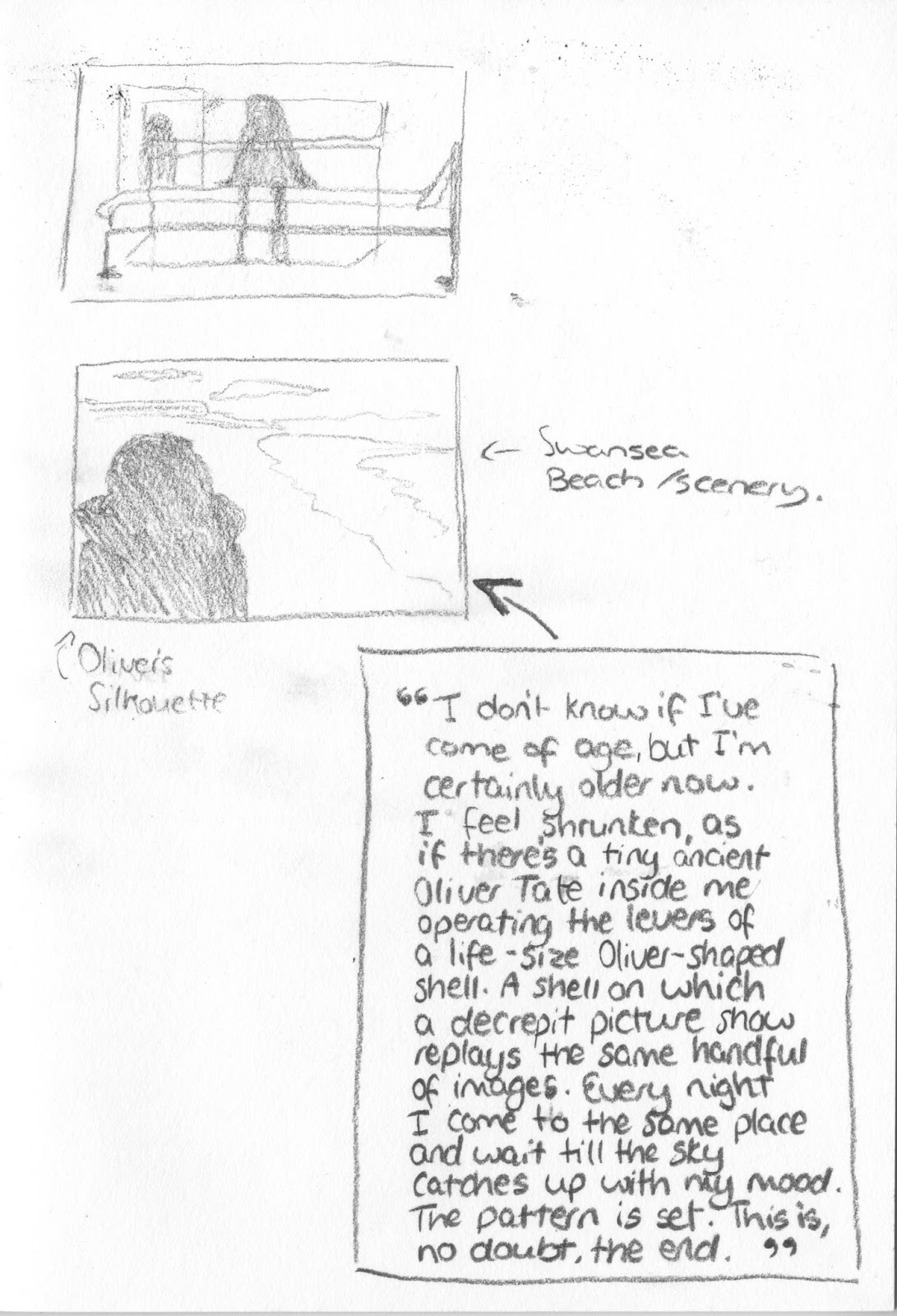
2. My second idea is for a wrap around book cover sleeve. I want to create quite a calm image that has an underline deeper meaning, based on the book quote above. When the image is unfolded and flat it will include a sunset scene of swansea coast with the silhouette of the main character on the left. I want to include the coast line as it's a common location throughout the book, plus the sea itself is the main metaphor. Furthermore I wanted to only include the silhouette of the main character because within the book itself it never gives a description of him and I think that this is so more people are able to put themselves in his position, therefore reading it is a lot more of a personal experience and I don't really want to take that away from the book. Plus I've chosen to do this as a wrap around cover so on the front cover the coast is the main focus and you only see the main character when you turn over the book, or after you've finished the book and you close it. In regards to the typography of the book title I have yet to decide what to do, but I plan to research different possibilities and I plan to choose something that will match the serenity of the coastal scene.
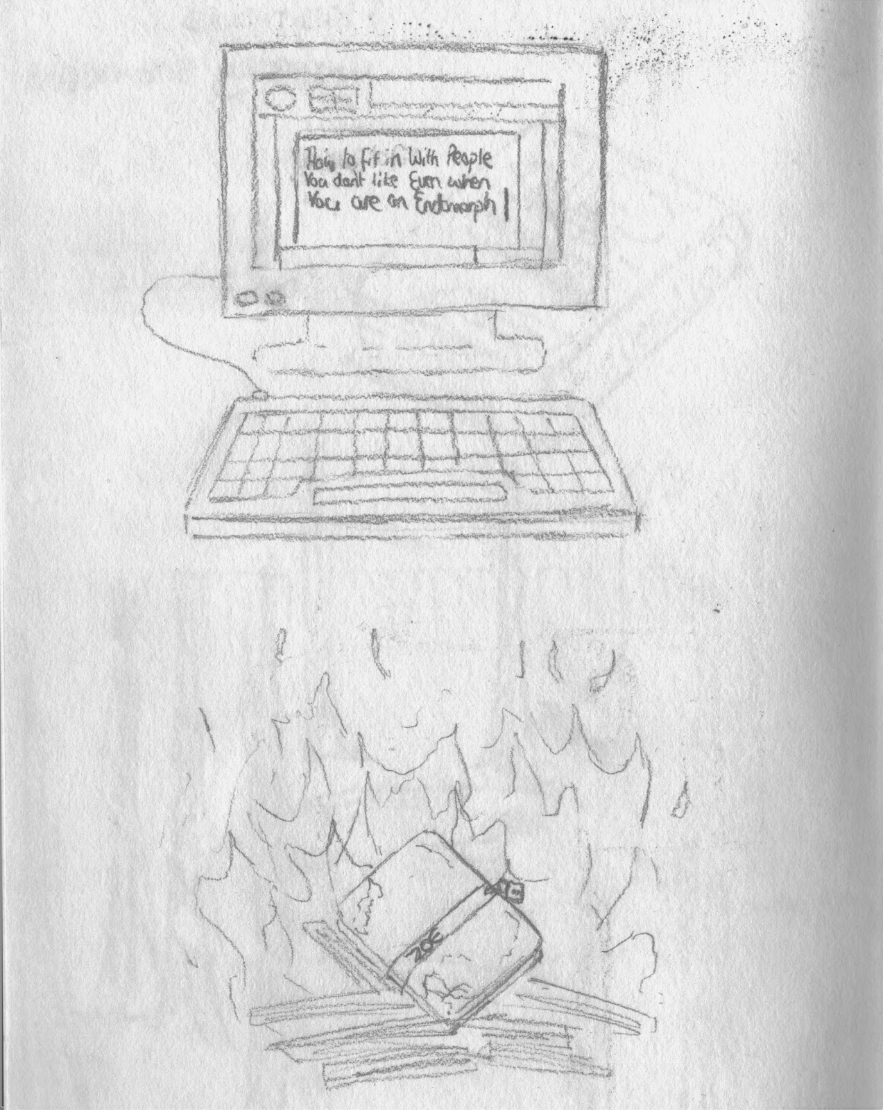
3. My plan for my final illustration is to go for a more comical scene to show the scope of the book and how it can go from tackling difficult issues to a really funny subject. I'm going to illustrate an old computer monitor and keyboard, as you can see from the sketch I did above. This illustration will also be the one I turn into a GIF and the animation shall be the text on the screen being typed. I also plan for the text to be in the same font type as it used in the book to ensure there is some continuity. Although this will be quite a simple GIF I believe it's better to do a this idea well, rather than struggling with a more complicated concept. Also for the background of this image, which will be Oliver's bedroom wall, I plan to use the pattern method I learnt previously in the module. I'm going to do this by painting, in Photoshop, some photos that don't have detail, similar to the work of Toby Neilan (http://tobyneilan.com/category/architecture/). Once I have created at least four of these photographs I'm going to turn them into a pattern that I can use to fill the background of the computer illustration.
Research Imagery-

Other Interpretations-

Nina Chakrabarti-
This book cover and variations of it is the main one used by the publishers of this book. I like the line work of the piece and the colour choice of blue to represent the ocean. Also I think this design strongly represents the scattered nature of the events in the book and the process of Oliver struggling to figure things out. However I don't think the composition of the images on this cover work that well, as the gap above the book title looks a bit off balance, although I can see the space is meant to be the sea.

Spanish Cover-
This is the cover used on the Spanish edition of the book, sadly I was unable to find who illustrated this particular cover along with the ones that follow. Another strong theme that is apparent on this cover is the use of the colour blue and although I quite like the imagery in the background I personally don't think that the figure silhouette in the foreground is a very good representation of the main character. This is due to the stance of the character being quite solid and confident which doesn't correlate with Oliver's characteristics.
This is the cover used on the Spanish edition of the book, sadly I was unable to find who illustrated this particular cover along with the ones that follow. Another strong theme that is apparent on this cover is the use of the colour blue and although I quite like the imagery in the background I personally don't think that the figure silhouette in the foreground is a very good representation of the main character. This is due to the stance of the character being quite solid and confident which doesn't correlate with Oliver's characteristics.
 Chinese Cover-
This is the cover used for the Chinese edition of the book. I really love the simplicity of the line work of the Submarine. Plus the simple colour scheme has quite a calming effect, as well as intriguing the viewer as to what the book is actually about. However I don't think the cover accurately represents the mood of the book as the yellow colour carries connotations of happiness, but I suppose for some people it could strongly represent anxiety. Furthermore I think that the style in which the submarine is drawn in is quite child-like, which I don't think gives the impression that it is a coming-of-age themed book.
 Film Cover-
This book cover was used shortly after the film adaptation of the book. I really like this cover as it uses very simple imagery to set the mood and when looking at it the blue half of the image portrays a very suffocating sensation. Plus the way in which the book title is written is really innovative, as it breaks down the word and makes you view it in an alternative way, so that the viewer doesn't automatically associate it with a literal submarine, this therefore creates intrigue.

Photo Cover-
This is a photographic version of the cover that has been used for a few of the editions. I really like this cover as I think it perfectly represents the mood and theme of the book. The subject of the photograph looking equally happy and crazed, therefore strongly showing the mood swings of teenagers. As well as the porthole that frames the image, giving it a very claustrophobic feel.
(Book Cover's Source- http://joedunthorne.com/index.php?/chooseyour/submarine-covers/)
Film Adaptation Analysis-

As part of my research of the story, themes and mood of the book I watched the film adaptation, which was released in 2001, and directed by Richard Ayoade. Although not completely true to the story in the book, the cinematography is beautiful and really helped me get an idea of the setting and the scenery of Swansea. Plus it really helped to see how another creative conveyed the themes of the book, mainly depression, in such a subtle way rather than being over cliche. When creating my own illustrations its really important to me that I don't spell out the premise of the book to the audience. This is because the book needs fill in the gaps and answer the questions that the illustrations leave, which helps to intrigue the viewer. Furthermore, making the illustrations slightly abstract and unclear correlates with the fact that depression is an invisible illness and it will help to give a slight insight to the isolation people feel in these situations.
Illustration 1-


Design 2


Draft-


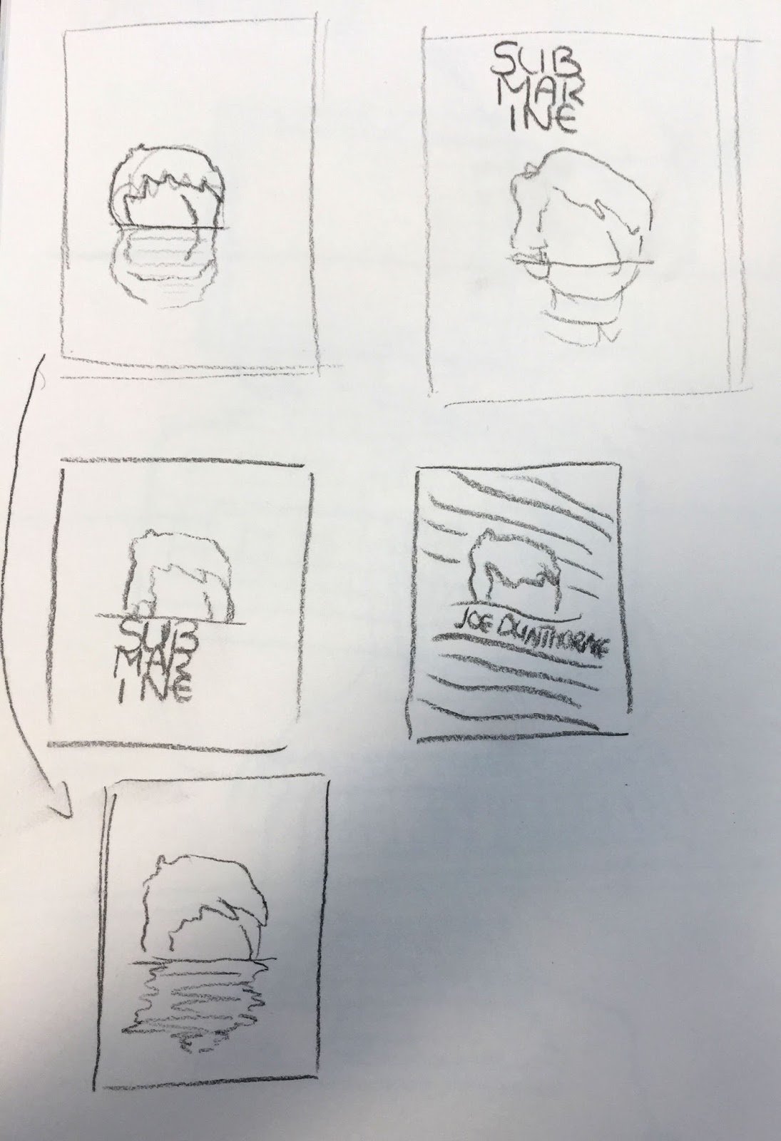

Illustration 2


For my final illustration I decided to go with the last sketch I drew. The first element I decided to create were the photos in the background of the image. To do this I used the same technique as a digital artist I found, Toby Neilan. His process involves using a large brush within Photoshop and painting over photographs, this method builds up an image that can be deciphered, without being too detailed that it draws your attention away from the main focal point of the illustration. To create my own version of these smaller illustrations I took stills from the film adaptation of the book and painted over them, so that they looked like photographs the main character could have taken.


For this illustration I decided to work with a more limited colour palette, using only and light, mid and dark tone to create the image. This method was recommended to me as it meant that I could focus more on the details and composition of the illustration, as I wouldn't have to worry too much about the colour scheme. Also using these 3 colours really helps to make the objects in the image look a lot more 3D and unified with each other.
